
Your cover page is the first document the jury reviews, sometimes in just a few seconds. It sets the tone for the reading even before the content of the internship report is opened. Yet, many students create it at the last minute, piling up information without visual hierarchy or checking the specific guidelines of their institution.
Confidentiality and validation: two steps before layout
Before choosing a font or alignment, two checks are essential. They are rarely discussed, but they determine the final version of your cover page.
The first concerns the specific guidelines of your institution. The order of logos, the official title of the diploma, the mention of the academic year, or the name of the educational supervisor may vary from one program to another, or even from one session to another. The Ministry of National Education regularly updates its reference documents, meaning that a template found online that is several years old may be outdated.
The second check focuses on the confidentiality of the company’s information. Displaying the logo, the name of the department, or the direct contact details of a company supervisor on your cover page may pose a problem. The CNIL reminds us that personal data must be processed with the consent of the individuals concerned. Always seek the approval of your host company before including these elements.
To structure this first page without starting from scratch, you can rely on a template for an internship report cover page that you will then adapt to the requirements of your program.
Elements to include on the cover page of an internship report

You may have noticed that some cover pages seem clear at first glance, while others overwhelm the reader with information? The difference lies in the distinction between what is mandatory and what is a personal choice.
Mandatory mentions
These elements allow the jury to immediately identify your document and link it to your academic path. Here’s what must appear on any cover page of an internship report:
- Your first name and last name, followed by the title of your program and the current academic year
- The name of the educational institution, accompanied by its logo if required by the guidelines
- The name of the host company, the relevant department, and the exact dates of the internship
- The title of the internship report, formulated precisely (not simply “Internship Report”)
- The names of the company supervisor and the educational supervisor, if required by the institution
A precise title anchors the subject of the report from the cover. Instead of “Internship Report at X”, prefer a formulation that reflects your main mission, for example, “Optimization of the Billing Process within the Accounting Department of X”.
Optional mentions
A subtitle, a “confidential” mention, or a simple illustration can enrich the cover page. But each addition must be weighed. A poorly chosen visual or a redundant subtitle can clutter the cover instead of enhancing it.
Cover layout: visual hierarchy and readability
The layout is based on a simple principle: guide the reader’s eye from top to bottom, from the most general to the most specific. The name of the institution and that of the company are usually placed at the top of the page. The title of the report occupies the center, in a larger font size. Your personal information and the dates are at the bottom.
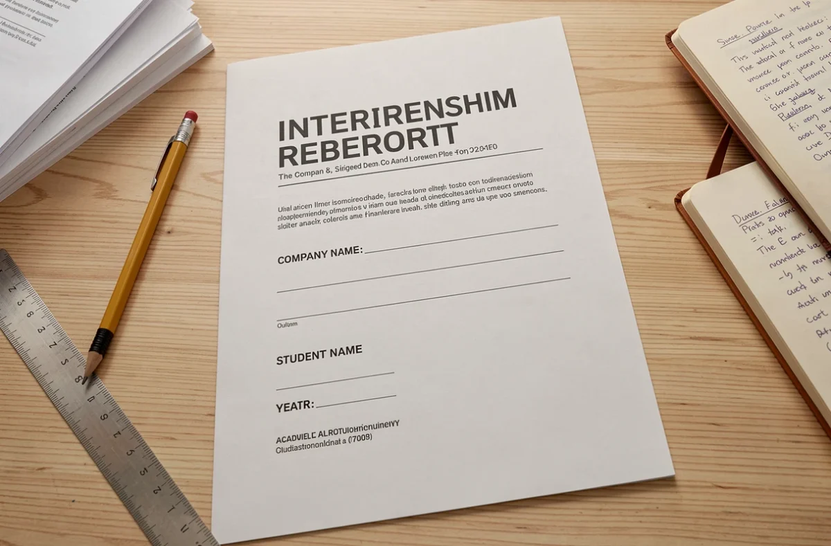
Why this order? Because the jury first identifies the institutional framework, then the subject, and finally the student. This natural vertical reading prevents the reviewer from having to search for information.
Typographic choices
Limit yourself to a maximum of two fonts: one for titles, one for the rest. Classic fonts like Arial, Calibri, or Garamond remain safe choices. Avoid decorative fonts that hinder readability.
The title font size should be significantly larger than the rest of the text. A visible gap between the title and other mentions creates hierarchy without resorting to graphic embellishments.
Colors and logos
If your institution imposes a graphic charter, follow it. Otherwise, a palette limited to two colors (plus the black of the text) is sufficient. The logos of the institution and the company are placed at the top of the page, aligned or on either side, provided that the company has given its consent.
Digital cover page: preparing an accessible PDF
The majority of internship reports are now submitted in PDF format. Many students export their cover page as a flattened image, which poses an accessibility and practicality issue.
The title and mentions must remain selectable in the PDF. A reviewer who copies your name or the title of the report to fill out an evaluation grid should not have to retype it manually. If you create your cover on a design tool, export it while keeping the text layers.
- Check that the text remains selectable after export by opening the PDF and trying to highlight each mention
- Add metadata to the file (document title, author) to facilitate archiving by the institution
- Name your file explicitly: “Internship_Report_FirstName_LastName_Company.pdf” rather than “final_v3.pdf”
These details may seem minor, but they reflect a rigor that the jury notices. A well-named document, with accessible text, presents a professional image even before the introduction is read.
The cover page of an internship report does not need to be spectacular. It needs to be complete, readable, and compliant with your program’s expectations. Check your institution’s guidelines, obtain the company’s agreement for sensitive elements, and focus your energy on a clear visual hierarchy. The rest, the jury will find in the content of your report.